CONTEXT
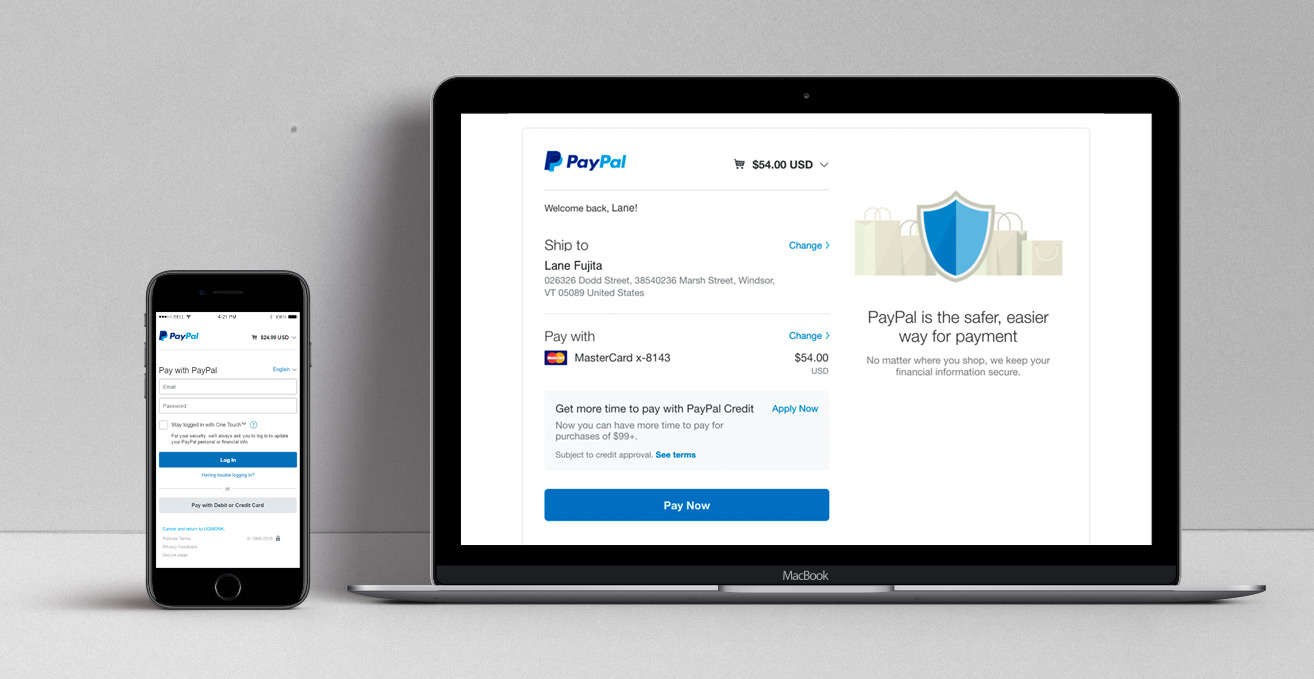
Checkout had always been PayPal’s bread and butter. With a close integration with eBay (its parent company until 2016) and an ever growing list of partnerships with LEs and SMBs, why fix it if it isn’t broken? But under the hood, our checkout experience was a tangled web of code and outdated UI, generating unnecessary friction and decreasing conversion rates. More importantly, mobile payments were starting to explode across the world, and PayPal was in danger of being usurped by more mobile-friendly experiences. In order to keep up with these rapidly accelerating market changes, in 2012, executive leadership sponsored a complete reimagining of PayPal Checkout, leading PayPal’s Checkout team into the mobile-first world.
UX STRATEGY
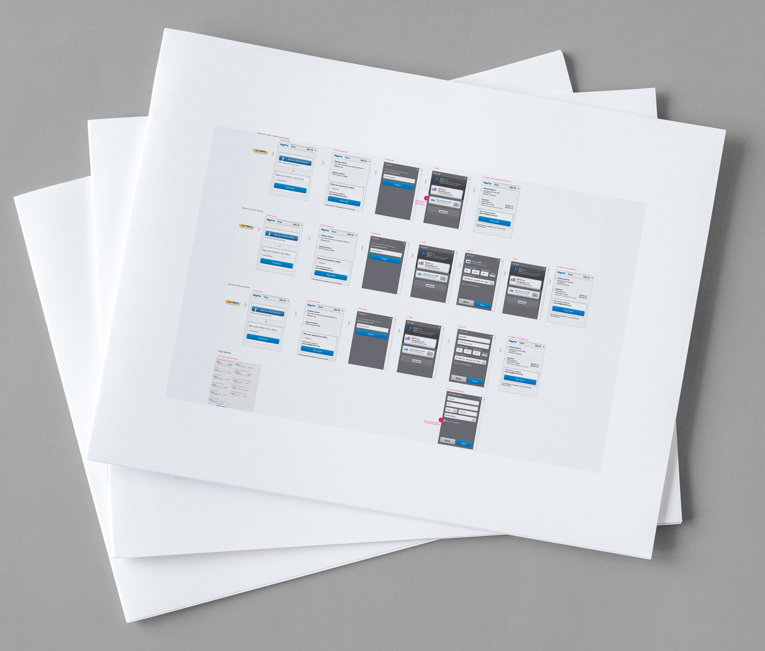
As the first Lean UX team at PayPal, we had a few key challenges:
- How to break apart and put back together a re-directed, one page desktop flow into a responsive, flexible design?
- How to use emerging technology and a mobile-first approach to reduce returning customer friction while still providing security in the payments process?
- How to spearhead a revolutionary way of working inside a large company that brought together all necessary teams at once instead of falling into the comfortable, silo-ed ways of doing (which included lengthy release cycles)?
As lead designer on the member experience, I was responsible for defining the flows and UI for every checkout experience upon log in, including management of a PayPal member’s payments methods (aka “wallet”) and shipping/payment addresses (aka “address book”).
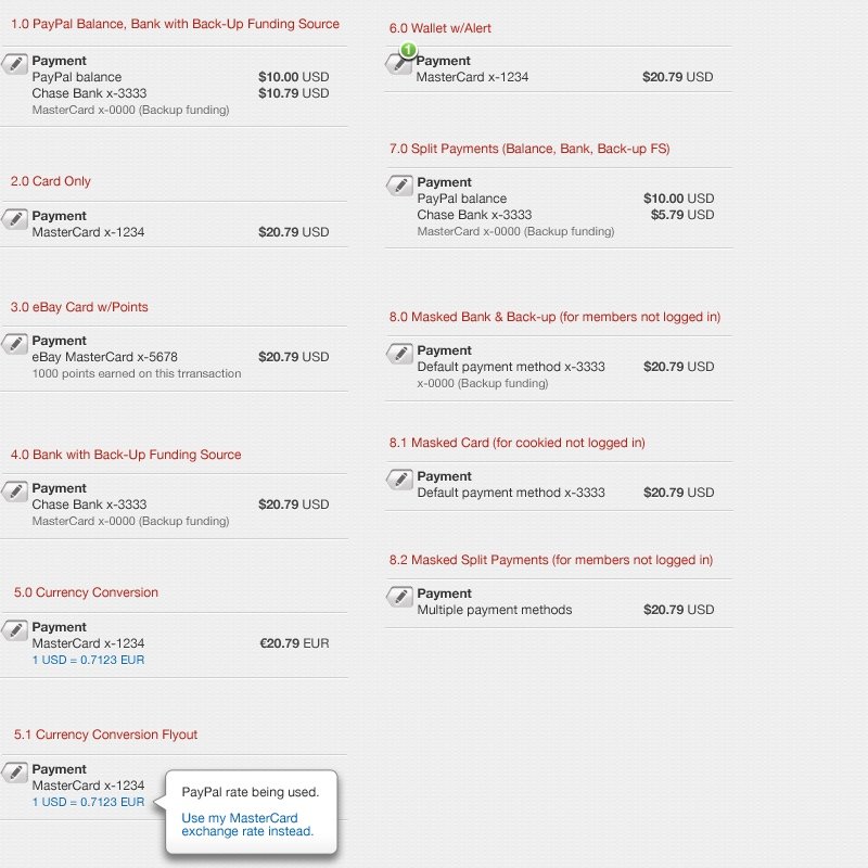
Of utmost importance to me as the PayPal member advocate, was to make it as easy as possible for them to use PayPal. Missing addresses, expired credit cards, unclear payment hierarchies and currency conversions, all made it difficult to complete checkout.
I ferreted out these edge cases and resolved them in order to create a seamless, frustration-free experience for our customers.
RESEARCH
The team was not only testing a variety of flows, UI, and visual designs, but also changes to the core checkout product. We had to work closely with our researchers to understand user feedback in order to accurately resolve the root cause. The team iterated daily via white-boarding sessions that went into rapid iterative user testing (please check out all the variations on team lead Cody Evol’s portfolio).
OUTCOMES
This project was the fastest roll-out from team conception to MVP launch in PayPal history, which at the time, was revolutionary (now it’s common and laughingly slow compared to some).
It validated the Lean UX model that brought together product, design, research, development, legal, marketing and key stakeholders.
Business wise, it created a 318 BPS conversion lift and overall increase in share of checkout.
The product, dev, and design leads received a patent pending for “System and Method for Simplified Checkout.”